
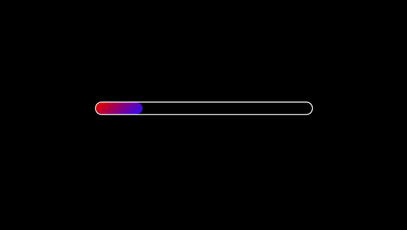
Create Gradient Progress bar with animation using CSS
HTML:
<div class="progress-bar"></div>
CSS:
body{
    background: #000;
    color: #fff;
}
.progress-bar{
    width: 450px;
    height: 24px;
    border-radius: 20px;
    border: 2px solid #fff;
    position: absolute;
    top: 50%;
    left: 50%;
    transform: translate(-50%, -50%);
    overflow: hidden;
}
.progress-bar::after{
    content: '';
    background: linear-gradient(135deg, #fd0000, #1d00ff);
    width: 0;
    height: 100%;
    border-radius: 20px;
    position: absolute;
    animation: progress 2s linear forwards;
}
@keyframes progress {
    100%{
        width: 90%;
    }
}