
Create Neon style text or button for website with the help of HTML and CSS
HTML:
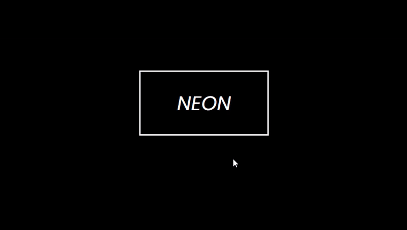
<h1 class="neon">NEON</h1>
CSS:
body{
    font-family: 'poppins', sans-serif;
    background: #000;
}

.neon{
    color: #fff;
    border: 4px solid #fff;
    padding: 30px 70px;
    width: fit-content;
    margin: 200px auto;
    font-size: 50px;
    font-weight: 400;
    font-style: italic;
    transition: text-shadow 0.5s, box-shadow 0.5s;
}

.neon:hover{
    text-shadow: -2px -2px 10px #fff,
                2px 2px 10px #fff,
                0 0 20px #f10,
                0 0 40px #f10,
                0 0 60px #f10,
                0 0 80px #f10,
                0 0 100px #f10;

    box-shadow: 0 0 5px #fff,
                inset 0 0 5px #fff,
                0 0 20px #08f,
                inset 0 0 20px #08f,
                0 0 40px #08f,
                inset 0 0 40px #08f;
}
Thanks for the short tut.
Leaving the code makes life easier for learners as well💪🏿
👍🏾👍🏾👍🏾👍🏾
Thank you for the code.